Exercise 2: Adding Style to Data
Now that you have data loaded, you can add some style so that the data is represented on the map in a useful way. We're going to look at two or three styling options and try them out.
Note: Styling is a huge field, and we can only scratch the surface here. If you have time after you have completed the exercises below, explore the other styling options in the
Styledialogue.
First we'll look at the data itself.
- Look for the
Open Attribute Tablebutton in the toolbar, and click it - You'll see all the data in the CSV file appearing in the table - so although you have created a map layer, all your source data is still available
- Double-click on the layer name, and click the
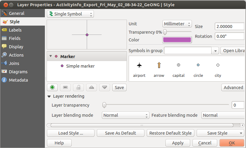
Styleoption - you will see a screen like this
- This is where you control how the layer appears on the map
The first thing to decide is how you want your styling to be driven - this is set using the button at the top left of the style dialogue.
The options are:
Single symbol: show all the points in the same way (for example to mark all settlements with a red circle)Categorized: show points differently based on the value of one of the fields (for example to show settlements with a different coloured circle depending on the province they are in)Graduated: show points differently depending on a classification (for example to show settlements based on the population banding they fall into)
In this exercise, we are going to use the Graduated option, but have a look at the others later.
- Set the button in the top left of the dialogue to
Graduated - In the
Columnfield, selectPop_1- this is the column we will use to drive the style - Choose a
Colour Rampto represent the data - In the
Modefield, selectQuantile - Click
Classifyto allocate the data points to the classification value bands - Click
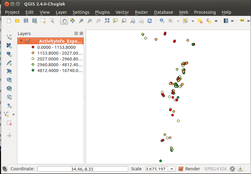
OK - Your layer should now look something like this

Styling needs careful thought to make sure that your map represents the data in a way which is meaningful to the user - this is the art of cartography! In practice this usually means trying out options, and seeing what looks best - then getting some user feedback (e.g. from your neighbour). Spend a few minutes trying out styles.
Here are a few things to look at:
- Data-driven size: Use
Advanced > Size scale fieldto vary the size of the symbol depending on the value of a field (e.g.Pop_1). If the symbols are too big, change the settings for the size of the symbol until it looks right (the method for this depends on the type of styling). - Heat map: Try the
Heat mapoption in the style type selector at top left. - Symbols: Use a single symbol, and experiment with the settings to change its appearance. You can also import symbols from elsewhere, using the
Open Librarybutton.